What are Condensed Fonts and Why You Should Use Them

Posted on October 3, 2023 | Updated on October 3, 2023
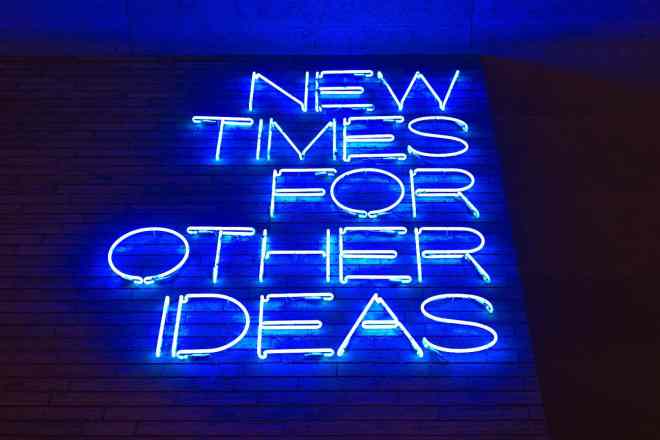
A typeface is a family of related fonts. And just like a family, typefaces comprise different members with distinct characteristics. There are regular-sized, heavy, tall, and small fonts. Condensed fonts are the taller and narrower members of the family.
What are Condensed Fonts?
As fonts build a typeface, their use is categorized based on their characteristics. A condensed font is considered a narrower version of a standard typeface. Its narrow width and tall characters make it a good choice for filling tight spaces or lines of type.
Due to their tall, narrow nature and because the letters are more closely spaced, condensed fonts are known to be more challenging to read than regular-sized fonts. However, this unique characteristic can be leveraged to make a lasting impression on readers.
Pros and Cons of Condensed Fonts
Typography can do a lot for graphic design, like influence, entice, and even put off audiences. That’s why it’s important to recognize its merits and uses. Whether you’re working on an infographic, signage, web design, or any graphic design project, you can find a use for condensed fonts.
However, you must understand a font’s strengths and weaknesses before using it. Here are the pros and cons of condensed fonts you should consider:
Pros:
- Save space — If you’re working on a project requiring a limited line or space, condensed fonts are a viable option. You can put up to twice as much copy in the same space using condensed fonts than regular typefaces.
- Good for subheadings — Using subheaders is a great way to break the monotony of text in a long piece of writing. Combining headers and condensed fonts can give your audience a much-needed breather when facing a block of text in your design.
- Can decorate headlines — Condensed fonts can add visual appeal to a site or page. If used with few words, the tall letters can make headlines pop. This is a great way to make headlines or short lines of text on a page more noticeable, especially when intentionally spaced out.
- Provide contrast — Tall lettering can emphasize an idea or tagline in graphic design. It can also be used to make a comparison between important points and less significant ones. Using a different font for titles can make your website stand out and appear less serious.
- Introduce modern visual elements — Due to their tall and narrow nature, condensed fonts can add a modern or stylish look to your design. They can be great for stand-alone texts that can help grab your audience’s attention.
Cons:
- Unreadable with a small size — If you’re working with lots of text, you might want to avoid using them. Using small sizes and cramming as much text into a line as possible spells disaster for your site’s readability.
- Can make lines look cluttered — When used correctly, condensed fonts can bring a short line of text to life. If overused, it can make even a short sentence look like a chore. Stringing too many words using a condensed font can make your design look cluttered and disorganized.
Examples of Condensed Fonts
Some examples include:
- Helvetica Condensed
- League Gothic
- Arial Narrow
- Garamond Narrow
- Futura Condensed
There are more examples out there which can be downloaded for free. It’s wise to look at which fonts you can use for websites, products, and commercial purposes since some have specific permissions. Other fonts for desktop and web use must also be purchased for various applications.
Tips and Tricks
There are ways to leverage condensed fonts to improve legibility and design styles. You just need to know when and how to use them to make your work stand out. Here are some tips if you’re planning to use them:
1. Use condensed fonts sparingly
Condensed fonts are a great way to accentuate or complement your site’s overall design. They can do more than just emphasize lines you want to pop out from the screen. As stated above, tall and narrow fonts can be used for headers, subheaders, and titles.
It can be easy to get too excited when using a font for the first time. Limit the use of condensed fonts to maximize their effect. Sometimes, less really is more.
2. Increase the size
Condensed fonts get their shock value from their height. Take advantage of this and increase the size appropriately. Scale your titles or interesting lines to make them look appealing.
Increasing your font size is an effective way to emphasize a section or line of text. Remember to add a little spacing between the letters to account for the font’s tight tolerances.
3. Choose color combinations that work
Your font choice is already bold and in-your-face. Use color combinations that complement it to bring out the letters more. You want your audience to see the text and what it says. Putting too much color or using the wrong shades can make your design awkward.
4. Use plain backgrounds
As you try to make your design stand out, you might be tempted to add a few elements to the background that can add clutter and noise. Steer clear from busy backgrounds and use a plain one instead.
You already have tall letters to work with. Make those the prominent elements of your design instead of adding a background so tacky that it chases away your site’s visitors.
5. Use in tables or charts
Condensed fonts can add neatness to a design if used properly. Try using them if you’re working on an infographic, table, or chart. These fonts can organize your text and optimize your space to make the content easier to digest.
Again, use a few words for different blocks of text and increase the font size if needed. Keep things tidy and sophisticated, especially when working with facts and figures.
A Time and Place for Everything
Like with most things, there’s a time and place for using condensed fonts. Knowing when and how to use them will enable you to bring life to a line of text or create a story using your font choice.
Condensed fonts have their merits. You must understand what they can do and know the appropriate time to use them. Try using them on trial projects and see which fonts and approaches work for you. There’s no harm in trying.